
VitaBloom

Designing personalized health experiences for 1.3B women navigating hormonal health
VitaBloom is a mobile application developed by Interact Health Pro. It is designed to promote sustainable health through positive lifestyle changes. It combines expert-backed guidance with user-friendly features to support better nutrition, physical activity, and overall well-being. The app offers two options: a general wellness plan for users seeking foundational support and a personalized plan tailored to users’ specific goals, dietary preferences, and health conditions. The app targets women affected by hormonal changes because of pregnancy or menopause and  provides them a compassionate, customized experience. By blending structure with flexibility, it empowers users to take charge of their health in a way that aligns with their unique lifestyles and challenges.

Problem

Women experiencing hormonal shifts during menopause or pregnancy face weight management challenges that standard fitness and diet apps are not built to handle. These apps offer one-size-fits-all plans that ignore the physiological and emotional complexity of hormonal health; resulting in disengagement, frustration, and ultimately, abandoned goals.

Objective

Design an intuitive mobile experience that delivers genuinely personalized weight management; one that accounts for hormonal health, diverse lifestyle contexts, and long-term behavior change rather than short-term fixes.

Challenge

The core design tension was balancing simplicity with depth: the app needed to feel approachable for users with limited digital literacy, while offering the personalization complexity that the target audience actually required. Layered on top of this was the need to build trust quickly; a critical factor for a health product targeting a demographic that has historically been underserved and over-prescribed.

My Role

I led UX and UI design for two high-priority sections of the app: the onboarding experience (introductory screens, the user survey, and account creation) and the personalized plan feature. I owned the full design process end-to-end; from framing research goals and running usability studies, to making and defending key design decisions with the client.
My work also included UI design for both sections, where I was responsible for visual consistency, accessibility compliance, and aligning the interface with the brand’s positioning around trust, motivation, and health-first guidance.

Research

  • Research Goals
  • Survey
  • Interviews
  • Competitive Audit
  • User Journey Map
To better understand the target audience, I began the user research phase with a clear direction provided by the client: the ideal user is an elderly woman who struggles with weight management due to hormonal changes related to pregnancy or menopause.

Research Goals

With this defined audience, I designed a user survey to uncover deeper insights into their motivations, challenges, and preferences around health and wellness. The research goals are:
  • Understand users’ motivations for losing weight
  • Identify common challenges and barriers in previous weight loss attempts
  • Evaluate user experiences with existing weight management or wellness apps
  • Determine whether users prefer guided routines or self-directed plans, which helps inform the app’s personalization model.
  • Understand the demographics and health conditions of the target audience

Surveys

I designed a screened survey targeting women within the defined demographic. Questions were framed to surface emotional motivators, not just behavioral preferences; because for this audience, the emotional dimension of health management is often the deciding factor in whether they stay engaged or not.
Insights
Survey results reveal that:
  • Long-term health and quality of life were the primary motivators; weight loss for its own sake ranked lower than expected.
  • Inconsistency and the absence of personalization were the most frequently cited reasons for abandoning previous apps.
  • Cluttered, overwhelming interfaces were a significant barrier ; simplicity wasn’t just a preference, it was a prerequisite for trust.
  • Accountability and human connection were strong engagement drivers, pointing toward social or coach-supported features.
  • Users were split between wanting guided structure and wanting flexibility; a finding that directly shaped the dual-plan model.

User Interviews

After analyzing the survey, I conducted brief follow-up interviews with 5 participants to validate key insights and explore their emotional drivers and daily habits in more depth.
Insights
The user group not only confirmed our initial assumptions about lack of personalization in current weight management apps, but also revealed that:
  • Most of the apps are either nutrition focused or just workout focused, and do not cover all aspects of weight management and well-being.
  • Users want a holistic approach to weight management that includes not just diet and exercise, but also emotional well-being, sleep, and stress management. This became a foundational principle for the personalized plan design.

Competitive Audit

To identify gaps and opportunities in the current market, I conducted a competitive audit of leading weight management apps. The goal was to evaluate existing weight management apps and uncover gaps and opportunities for designing a more holistic, user-friendly, and inclusive solution. I evaluated apps based on their features, usability, personalization capabilities, and how well they address emotional well-being, sleep, and stress. Beside these elements critical for long-term weight management, UI design and accessibility were also taken into account.
Key Takeaways
Most competitors focus heavily on either nutrition or fitness, but fail to deliver a truly holistic experience. Emotional wellness, sleep, and stress management are often underrepresented. Additionally:
  • UI Design varies in quality, with some apps being visually cluttered or hard to navigate.
  • Onboarding experiences are mostly generic, missing the opportunity to tailor the app to individual user needs from the start.
  • Accessibility is rarely prioritized, limiting usability for people with impairments.
There is a clear gap in the market for an inclusive, user-friendly app that offers personalized, all-in-one weight management; blending physical, emotional, and mental wellness.  

User Journey Map

The user journey map illustrates the typical experience of users navigating a weight management app, highlighting their emotions, pain points, and opportunities for improvement at each stage.
Starting the design
  • Sitemap
  • Wireframes
  • Mid-fi Prototype
  • Usability Studies

Sitemap

The sitemap outlines the app’s overall structure, organizing key features like onboarding, personalized plans, nutrition, workouts, trackers, profile, and expert resources. It also includes community-driven areas and challenges to support motivation and engagement, all within a clear and intuitive navigation system.

Wireframes

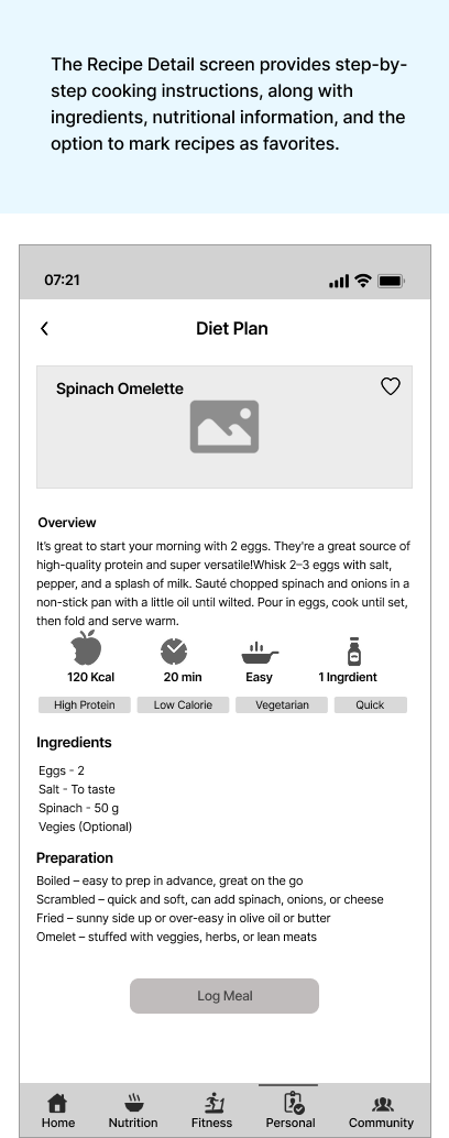
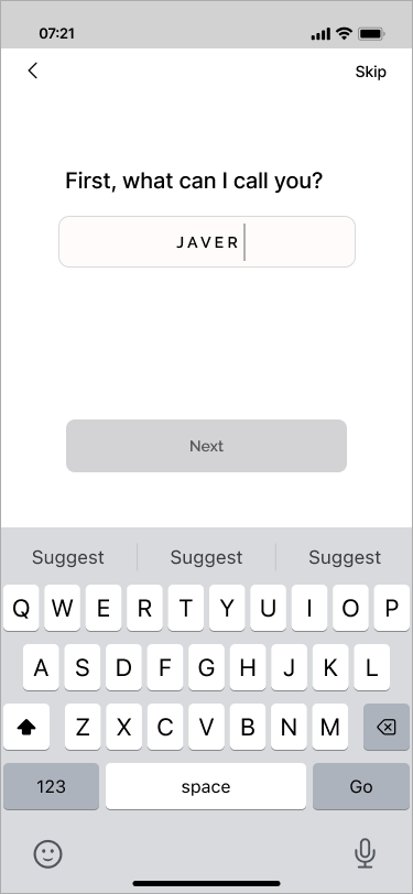
Given the extensive scope of this weight management app, I focused on designing two critical sections. The first includes the introductory experience (i.e. onboarding survey, account creation, and login screens) crafted to ensure smooth entry and personalization. The second is the core feature of the app: the Personalized Plan section, where users receive tailored guidance based on their goals, preferences, and health needs. Below are the wireframes showcasing my work in these areas.
Personalised Plan
Onboarding Screens
Mid-fi Prototype

To validate the user flow and overall layout, I created a mid-fidelity prototype of the app. This prototype includes key interactive elements across the onboarding and personalized plan sections. It was used in usability testing to gather feedback on navigation, clarity, and functionality before moving to high-fidelity design.

Usability Studies

I conducted unmoderated usability testing with five participants. Findings from the testing helped guide the designs from wireframes to mockups.
Onboarding Survey Section Tasks:
1- Complete Mandatory Survey and Create an Account
2- Go Back and Edit Survey Responses
3- Skip the Optional Plan and Go to the App Home/Dashboard
4- Complete the Optional/detailed survey and Look for Your plan
Personalized Plan Section Tasks:
1- Can you see the full list of meals and workouts you need to complete in a day
2- You’ve just had breakfast. Log your meal in the app
3-You ‘hv followed the whole diet plan for the day. Quickly log the full diet plan at once
4- Look through details of your workout plan and do one exercise.
5- You completed your workout. Now log it.
6- You have logged the workout. Now see your progress.
Refining The Design
  • Mockups
  • Hi-fi Prototype
  • Accessibility
Based on usability testing insights, key screens were refined to enhance clarity, usability, and user engagement.
In the initial design, users perceived each exercise in the workout plan as an individual, clickable item. However, the intention was for the exercises to function as a structured sequence within a complete workout. To resolve this confusion, the screen was redesigned to visually emphasize the flow and cohesion of the full workout plan.
The initial design used a ‘Later’ button to navigate to the dashboard, but users found it unclear. I revised the label and reduced on-screen text to improve clarity and flow.

Key Mockups

Hi-fidelity Prototype

To validate the visual design and user interactions, I created a high-fidelity prototype using Figma. This prototype replicates the final app’s look and feel, including typography, color scheme, imagery, and interactive flows. It was used in usability testing to observe how users navigate key features like onboarding, the personalized plan dashboard, and weekly diet/workout plans.

Accessibility Considerations

To make the app inclusive and compliant with WCAG 2.1 standards, I focused on:

  • Color & Contrast: Ensured sufficient color contrast and avoided relying on color alone to convey information (WCAG 1.4.3).

  • Text & Readability: Used scalable, legible fonts with clear hierarchy to support users with visual or cognitive impairments (WCAG 1.4.4, 3.1).

  • Screen Reader Support: Included text labels and alt text for non-text elements to enhance compatibility with assistive technologies (WCAG 1.1.1, 4.1.2).

  • Touch & Navigation: Maintained large touch targets and simple, consistent layouts to support easy navigation for users with motor or cognitive limitations (WCAG 2.5.5, 2.4.6).

Going Forward
  • Takeaways
  • Next steps

Impact

  • Usability testing on the high-fidelity prototype showed a 35% improvement in task completion time during onboarding and personalized plan navigation.

  • 80% of participants reported feeling more motivated and supported due to the app’s tailored, all-in-one approach.

  • The client confirmed the design aligned with their product vision, specifically citing the clarity of the user flows and the integration of wellness features as directly supporting their 90-day weight management program.

What I learned

  • I learned how to design features that sustain user engagement over time; by exploring gamification strategies and motivational triggers to address common drop-off points in conventional weight management journeys.
  • I gained experience to transform user input into personalized, easy-to-use experiences that remain intuitive even for users with limited digital skills.
  • I learned how to communicate design decisions clearly to clients with limited UX knowledge; using visuals, analogies, and user stories to build alignment and trust.
 

Next Steps

  • Work on implementing calendar-based booking, automated referrals, and possible AI support to connect users with nutritionists and fitness coaches.
  • Explore push notification strategies, habit-building nudges, and community features to support sustainable behavior change.
  • Run feedback sessions with dietitians, fitness coaches, or potential partners to ensure monetization methods align with user needs and expert goals.
  • Collaborate with marketing and product teams to plan beta launches, collect sign-ups, and build a community pre-launch.

More Projects
Image

VMS

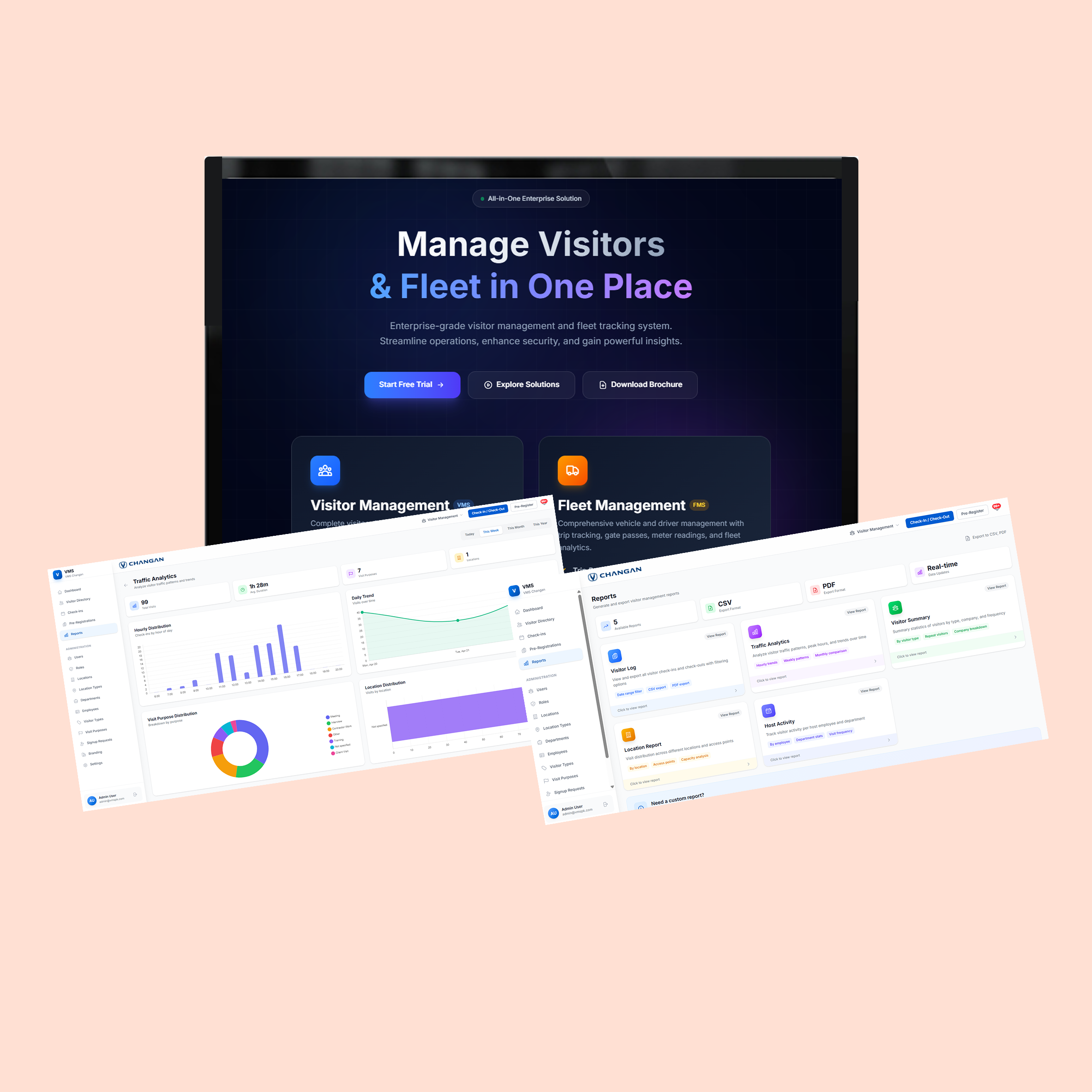
A B2B platform adopted by 3 businesses Client: ShapeVentures

View Case Study
Image

Rawayeti

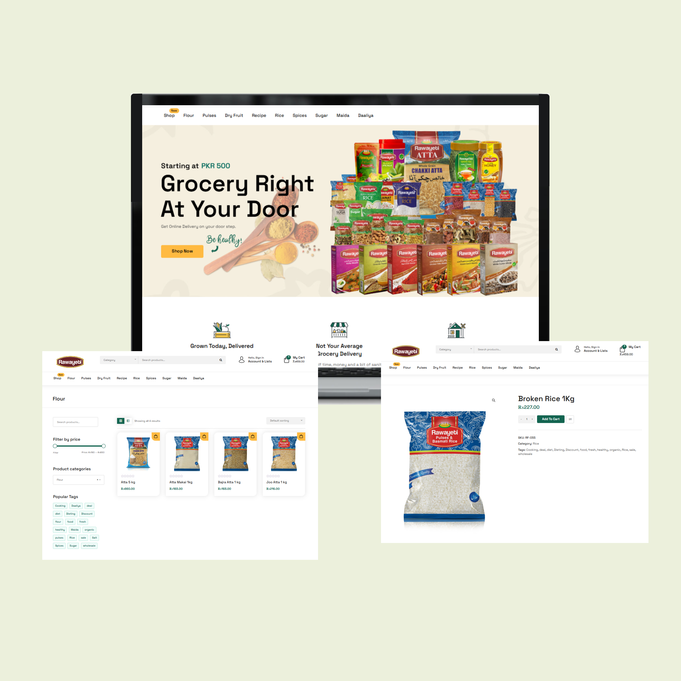
Website Redesign to improve conversion rates Client: Rawayeti (a Pakistanti grocery retailer)

View Case Study
Image

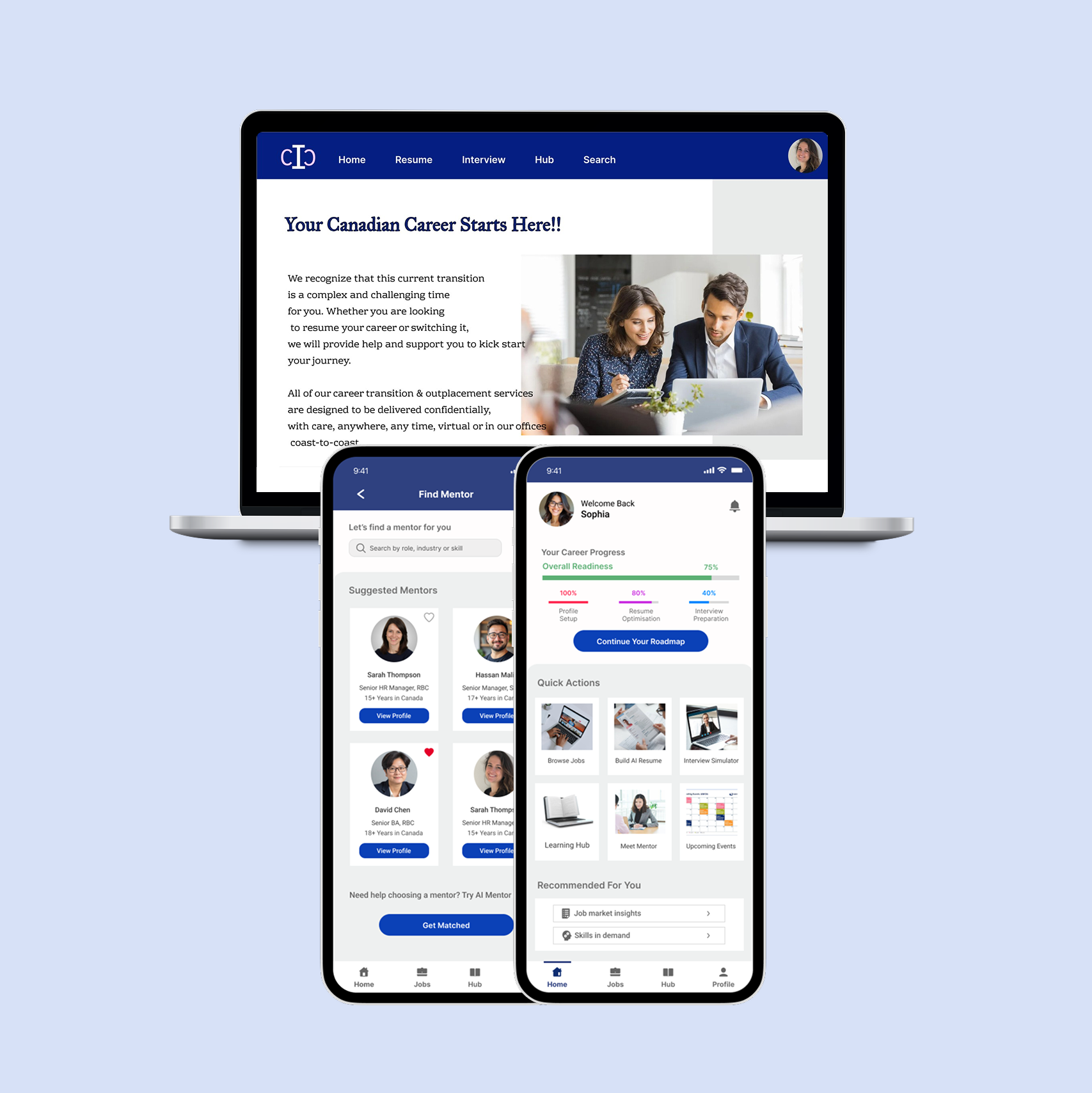
Immigrant Career Coach

Website & Mobile app design

View Case Study
Lets Connect!
Designed by Javeria Javed, all rights reserved.